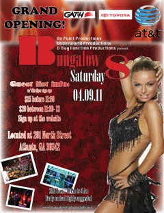
Creating the flyer was fun but exhausting. I spent over five hours putting all these little details to make it aesthetically pleasing to the eye. My flyer was of a club that I was going to open up in April called “Bungalow 8”. It is meant to represent a new, hip, cool club for adults twenty-one and over to come and experience and dance! The flyer was created to promote the grand opening of the new club.
In creating my flyer I asked my self a few questions from the website that you gave us to help us. I asked myself, “What is the purpose? What are the images and words that you are going to use to promote your flyer? Why would people bother to go to your business? What desire does you business fulfill? What do you want people to do when they read your flyer? Is your flyer an attention getter and is it selling the proposition?” By asking myself these questions I think I created a perfect flyer of color and flare that would grab anyone’s’ attention and let them know exactly why they should come, when they should come, and how they should get there.
The point of any flyer is to attract a person and get them to ask the question, “Why should I spend my time on money on going to that?” and with all the decoration and color that I used I feel that anyone would be attracted to attending my grand event!
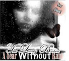
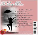
Making my own CD cover had to be my favorite part of this whole project. I got to design my own name to the band and the songs. It was kind of like I had my own band and I got to design everything. I started off trying to think of a good name for the band. "The Lovely Broken" was the name of the band that I decided to create, and like all good CD covers their main song is on the front of the CD cover along nect to the name of the band. So on the front of the CD cover I have the title of the band; "The Lovely Broken" and then crossing over underneath the title was their main song, "A year without Rain". It looked too plain in the front so I added a sign with a circle that had been feathered that said, "New Album!".
On the back of the CD cover I created my own names of songs, and put the title of the band again on the back to make it more attractive. I thought it would be a good idea to have a picture of a person basically questionsing where the rain was, just like the title of their main song. To make it more original I created my own record company called, "Meegoobee Music Records" because I thought it sounded fun and catchy.
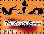
This was the last part of the project; the advertisement that my organization was promoting. I thought it would be clever to combine my dance club, "Bungalow 8" with the CD that I made "The Lovely Broken". So my advertisement was that the band "The Lovely Broken" would be playing at the club, Bungalow 8. I made sure that the colors of the advertisement kept up with the same colors of the club but also had the fun flirty cursive font as the CD cover.
I felt that creating the advertisement was what brought the project together as a whole. Combining the first two designs into the last design of the advertisement made it fun and it made everything make more sense.
All in all the whole project was time consuming, long, but fun. I tried to put in all my own types of creative spark and went along with the requirements. It was a fun project that tested different angles and different ways of creating all sorts of different types of projects. I think I have become really good at using InDesign because of all this.